

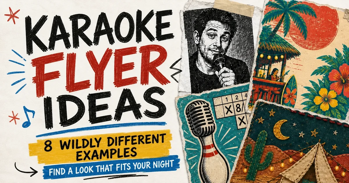
A useful karaoke flyer has two jobs: make the details easy to find and give the show a recognizable look. Start with the practical checklist in How to Advertise Your Karaoke Show, then spend ten minutes choosing that look.
Pick a look and repeat it
Pick a few rules and carry them through the flyer, story crop, event banner, table card, and weekly reminder.
- Choose three mood words. Try "warm, vintage, welcoming" or "raw, loud, underground." Specific words guide a design better than "fun" or "exciting."
- Choose a few colors. Two to four are often enough. Repeating them makes the flyer easier to recognize.
- Choose one overall style. That might be bold geometric lettering, photocopied paper, 1970s screen printing, hand-cut collage, flash photography, or something that fits the room.
- Make the key details biggest. Venue, day, and time should be the first things people see.
Always write the recurrence explicitly. "Every Thursday," "first and third Friday," "every other Saturday," and "last Wednesday of each month" tell people exactly when the night returns. A weekday by itself can look like a one-off event.
Borrow from the venue
The venue's sign, menus, wall colors, stage, furniture, and printed materials may already suggest colors and a style. Borrowing from those details connects the flyer to the room. A host working across several venues can keep a few recognizable host elements while adapting the rest to each place.
Music can suggest a style too. A rock night, country night, pop singalong, and 1970s lounge do not need the same lettering, texture, or colors.
A flyer can be rough, silly, loud, homemade, or slightly awkward and still look cool. Memorable real-world flyers often commit to one odd choice: a huge host photo, a local joke, clashing lettering, an unexpected crop, or one loud graphic. If it feels true to the room and its regulars, it gives people something to remember.
Find the middle ground
A flyer can be so clean that it feels anonymous, so decorated that the information disappears, or so polished that it could advertise any nightclub in any city. Aim for enough personality to be memorable while keeping the details easy to read. The balance will be different for every venue and host.
Canva templates and AI-generated artwork can both work. But give AI only "make a fun karaoke flyer" and it will happily pile on neon gradients, lasers, glitter, glossy 3D letters, and a crowded nightclub background until the page looks like a unicorn emptied a craft drawer onto it. A few specific choices usually produce something easier to recognize as yours.
Design for where it appears
A poster inside the venue and a flyer shared online have different jobs.
In-venue posters
Someone reading a poster inside the venue already knows where they are. Use the space for the recurring day, time, host, price, age policy, and the personality of the show. The venue name still helps the poster make sense in a photo, but the street address can stay off. A QR code can take someone straight to the social profile for updates. Label the platform and test the code before printing.
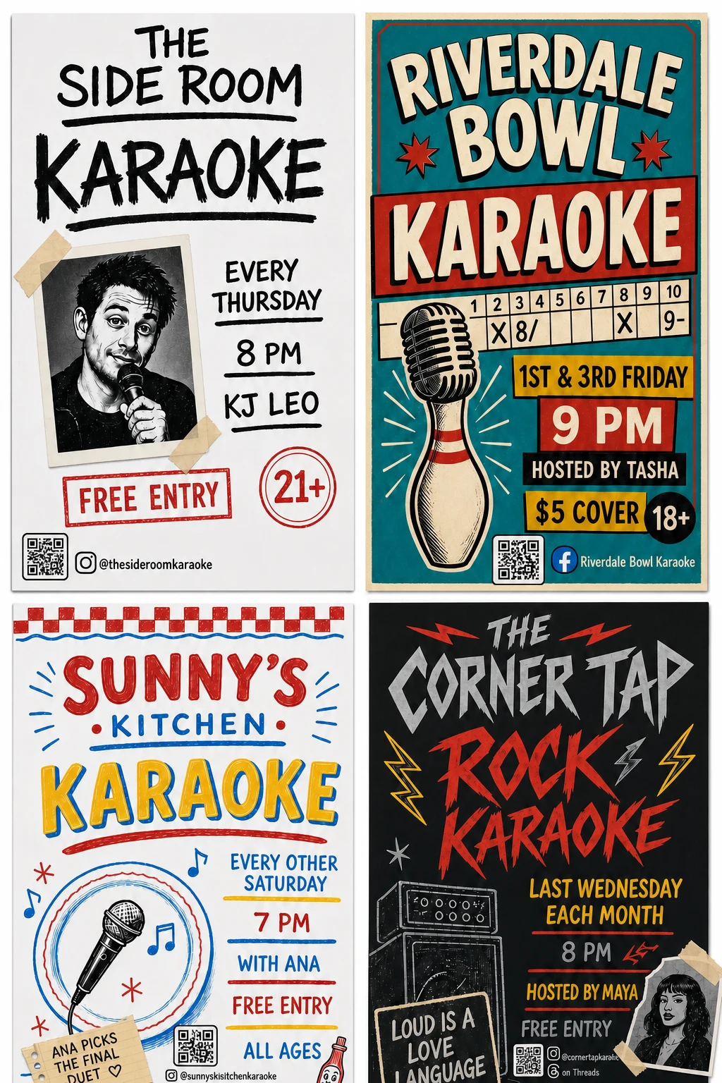
In-venue karaoke poster examples for four fictional venues. The different music and venue styles change the mood, while the useful show details stay easy to find.
Online flyers
An online flyer has to travel without the venue around it. Include the full address: street, city, and state or region. The city and state help someone recognize that the event may be near them before they read anything else. Name the platform next to the account for updates, and use its familiar icon so people recognize it at a glance. "Instagram: @yourvenue" still makes sense when someone saves the image and shares it somewhere else. If the same handle works on two platforms, say so. Repeat the same facts as text in the post.
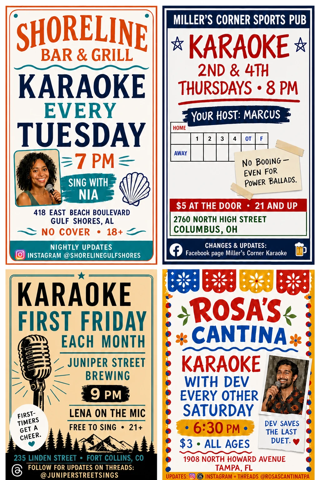
Online karaoke event flyer examples for four fictional local venues. The wording, order, and visual style change while the practical details stay easy to find.
These are starting points, not design standards. Someone with a bit of an eye for layout, lettering, or color can take them much further. They show how much difference one repeated idea can make and how many directions it can go.
Proofread every flyer before publishing. Check the venue, recurrence, date, time, address, price, age policy, and update account. Repeat the important facts in the caption so the promotion still works when the image is cropped, compressed, or read by a screen reader.
For advice on captions, distribution, reminders, and keeping details current, return to How to Advertise Your Karaoke Show.